An Alan Wake Sequence
2024 | Unreal Engine 5
Project Goals
Strengthen skills and understanding of architectural spaces and level design.
Practice level design fundamentals.
Design an experience that could fit within the Alan Wake universe and themes.
Build a concise level experience to near stood up quality as quickly as possible within a strict timeline of 2 weeks.
**NOTE: Stood Up is the equivalent of White Box Playable; The content is playable, the fun can be seen, the intent is clear, individual needs / dependencies are able to be identified and actioned on by other disciplines.
Project Overview
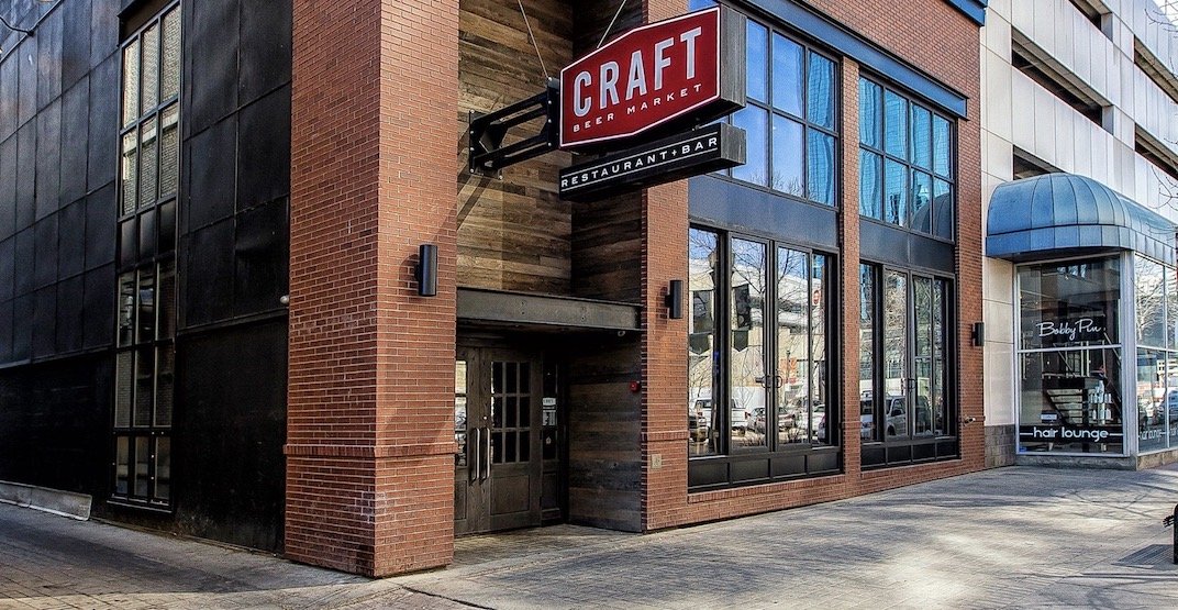
In Edmonton, there’s a bar called Craft Beer Market and it ended up serving as a major inspiration for this project. Largely due to finding the building really appealing, and I thought it would make for a great level space. The layout had several areas that were visually separated by small height changes, easily breaking up a large space into smaller distinct areas. The open industrial style also offered great opportunities for creativity when it came to changing the layout to suit my needs.
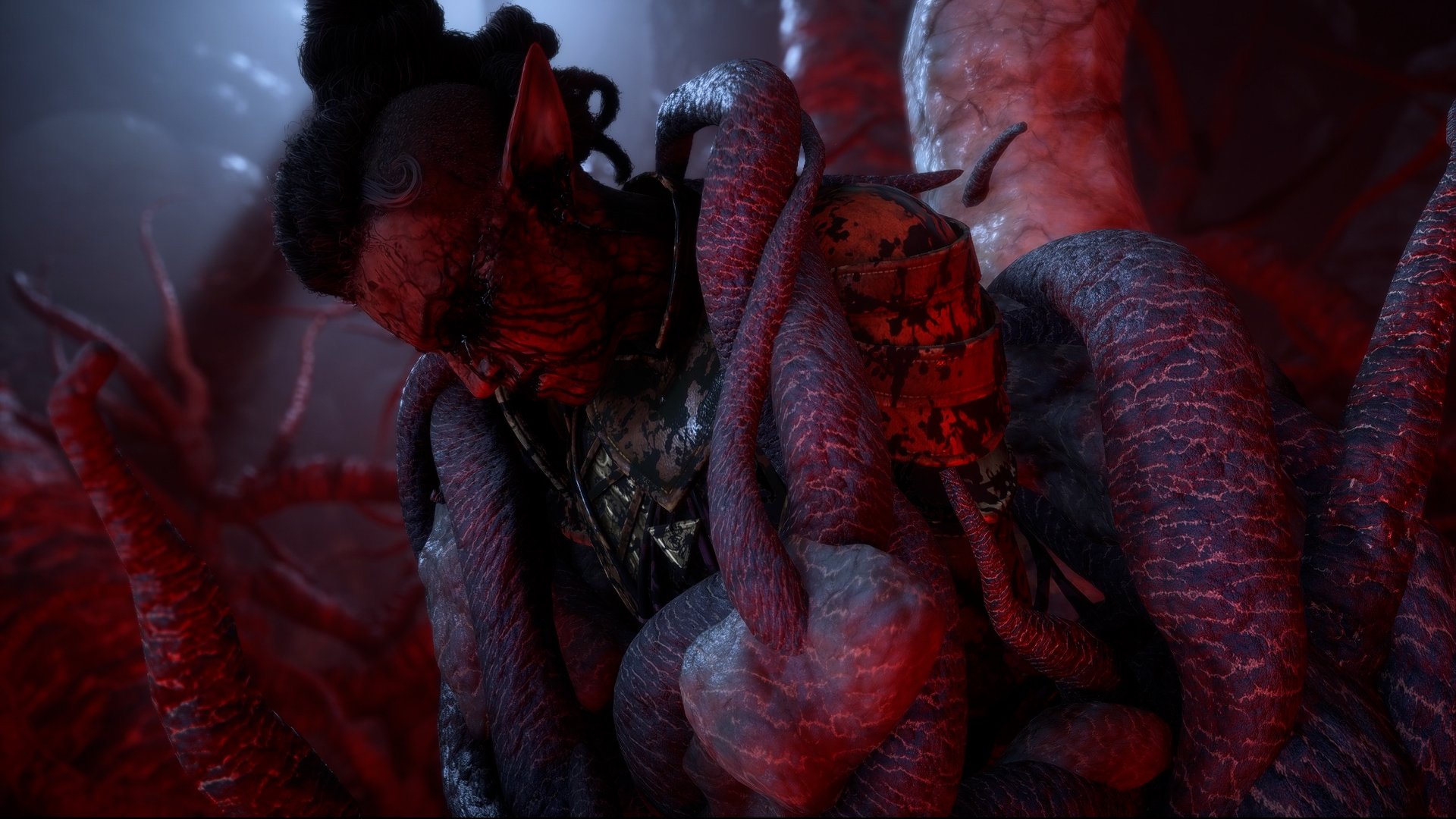
For this project I aimed to create an experience that was reminiscent of something you’d find in Alan Wake or Control. So, over the winter holidays, I developed a 5-10 minute experience where the player navigates a space that changes before their very eyes. Walls and doors appearing where there were none before, and statues that make the players ask the question ‘Did that just move?’.
Project Details
What I did
Built over the course of roughly 2 weeks (~56 hours)
Unreal Engine 5
Level Design
Scripting (Level Scripting and BLU assets).
Assets Used
Jakob W, Interaction with ALS (Advanced Locomotion System)
Player Character (w/ adjustments to the scripting to suit what I needed)
Moveable Crate and QTE blocker
Basic Zombie enemies for encounter placement
Blocking Starter Pack


Breakdown / Planning
Behold, a brilliantly sketched top down
Razors
While brainstorming the beats I had a few guidelines I set for myself to ensure cohesion.
Simple - They had to be quick to execute on for quick iteration and easily done by myself.
Understood at a glance - The player needs to know they’re progressing and that they hadn’t failed and are repeating the same space.
Perceivable changes - Because this was a short experience, I wanted to make sure as many changes as possible were unmissable for maximum impact.
Interest Curve
To set myself up for success I tried to define the intensity of each beat, to make sure I was hitting those peaks and valleys appropriately.
The way I went about it here was How complex is the change, and How much does it affect the player.
e.g. Small = Statue moves when players not looking
vs
Large = Environment completely changes
Through iteration the final product ended up not aligning with this much in the end, but this helped as a reference point I could look back to if I needed to gauge what the next beat needed.
Sketches
I like to get into the editor as quickly as possible, cause I know the plan will evolve the second I start greyblocking and iterating.
So, for this project, once I had the list of beats, I did a very preliminary top down of the spaces I needed based on my references of Craft Beer Market; Focusing on how the spaces could be used multiple times, fit together in multiple ways, where changes could happen and where they could be triggered out of sight.
Key Moment : Puzzle
It was always the plan to incorporate some sort of puzzle in this experience, but with the strict timeline, I needed to be concise with the execution.
Utilizing the razors of Simple, Understood at a glance and Perceivable changes I designed a puzzle that only used mechanics that were already introduced or built, was ‘bite sized’ to keep it engaging, and heavily leaned into the Alan Wake themes with changing environments that granted access to a previously locked off area.
Puzzle Breakdown
The switch is not powered but an easy to spot cable that acts as a leading line, guides the player to a generator that will give power to the switch.
Activating the generator powers the switch and triggers a small “jump scare” moment - a statue is spawned behind the player to indicate clear progress.
Once powered, interacting with the switch will allow the player to change the environment!
These changes will affect where debris is spawned; blocking the exit or the small room containing the needed crate for escape.
With the crate now accessible, the player can move it to the room with the generator and reach the ledge.
The leading line once again reinforces the player’s actions, reminding them to use the switch to change the debris location and place the crate near the ledge for escape!


Key Moment : Encounter
Combat was not part of the original plan due to the strict timeline and limited tools - it felt too ambitious. Continuing development however, I realized the pacing needed a final escalation to reach the quality I was aiming for.
While designing the encounter space there were several goals I focused on; supporting both stealth and agressive playstyles, providing clear affordances and fronts to guide the player to the exit, offering multiple paths for the player to choose from and creating visually distinct rooms to help with creating a mental map of the space.
Encounter Breakdown
To begin, I iterated on a top-down hlighting possible cover placements and potential paths for both the player and enemies.
I iterated frequently by switching back-and-forth between the top-down and the editor, making adjustments to both as I went along. This drawing, placing and iterating process continued until I felt there was enough cover and multiple avenues for both stealth and aggressive playstlyes.
I used angled fronts and highlighted key focal points or affordances, to guide the player toward the exit; allowing players to navigate the area organically, leveraging the environmental clues.
Once the encounter space and overall flow were finalized, I focused on visually differentiating key areas.
Simple details, like flickering lights, helped make a space feel unique, aiding players in building a mental map.
Even during the greybox phase, these small touches can significantly improve the layouts cohesion.
Watch me build it!
As a developer I take pride in leading with honesty, integreity and transparency; so here is an 8 hour video (32 hours sped up) that shows the creation of this level in almost its entirety.
Unfortunately not all of it was recorded due to file corruption (curses OBS!) or I’d forget to press the record button, only to realize several hours later.
Thank you!
If you made it all the way down here, thank you! Appreciate you taking the time to check how this little experience came together.
If you’re keen, take a look at my most recent professional work below!
Explore Professional Projects!


